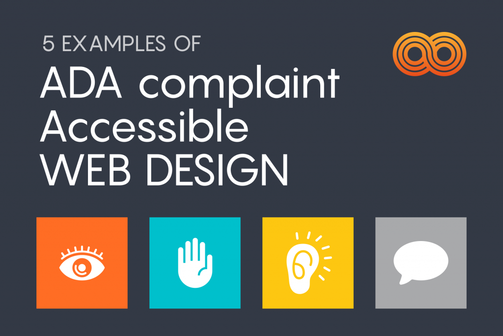
It’s a myth that web design and user experience suffer when websites are built with ADA Compliance. ADA compliance refers to the Americans with Disabilities Act Standards for Accessible Design, which states that all electronic and information technology (websites, apps, etc.) must be accessible to people with disabilities. It’s also a myth that websites lose ideal, user-centric functionality when they become ADA-compliant. As a website owner, you are liable to ensure your website is following ADA compliance. A great designer considers how all users interact with their designs. Here are 5 Examples of habits you should be thinking about for your website so that it is ADA compliant.
Proper Contrast Ratio
Some users with visual impairments may find it hard to read the text without a high enough contrast against the background, whether it be a plain text or text embedded within an image. Think about watching a movie with subtitles, the text often appears without anticipating the background. When the white text appears in a brightly lit scene, it is unreadable and the audience is left not knowing the dialogue. The minimum contrast for ADA complicity is a ratio of at least 4.5:1. Several websites offer a “contrast checker” if you need to know whether your design follows the guidelines or not.
Label Forms Clearly
Provide descriptive labels for all form fields. Make sure it is very clear to your users what exactly they need to do on the form and that they don’t need to miss these labels. Users with cognitive disabilities may lose track of the form field’s intent, so it is crucial to make all forms a completely seamless process.
A great designer considers how all users interact with their designs
Provide Feedback for Errors and Omissions
Nothing feeds frustration and anxiety more than making a mistake and not knowing why or how your efforts failed. Users should know right away what went wrong and how they can correct their actions. Alert users to errors with text, symbols, and colors so they are aware of what they did and don’t have to keep guessing. Providing feedback not only highlights the location of the error, but also helps you avoid losing valuable web conversions (sales, comments, newsletter signups, etc.)
Consistent Navigation
We rely on signs everywhere we go, and that remains true on the web. You should provide web users with consistent navigation, such as site search and site maps, while making sure that your labels, styles, and positions are all consistent. Breadcrumbs and clear headings provide further aid for understanding. Users with cognitive or neurological challenges depend on these consistent design elements to avoid becoming lost or frustrated.
Give Users Control
We love putting sliders on our site, and videos that are on autoplay, but Users with cognitive limitations may not comprehend your information quickly enough before the view changes or your video ends. Other users may want to start over, or go back and review something that they saw or heard. If the site features autoplaying audio or video, give users controls to replay, advance, and pause any media on your web pages.
In the end, all users benefit from accessible web design. Consider your user’s intentions, and find ways to align their website behaviors with your own business goals. If you would like to learn more about ADA Compliance or have a project that you’d like to get started on, please feel free to contact us here.