

Greenwich Library
Transforming an overgrown website into a clear, search-first experience
- UX/UI
- UX Strategy
- SEO
- Content Strategy
- Accessibility
About the Company
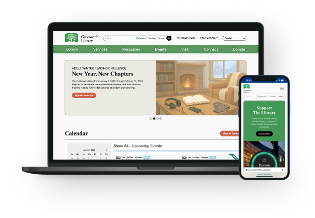
Greenwich Library is a large public library system serving a wide range of audiences — families, students, professionals, and lifelong learners across multiple branches. The website is a critical access point for services, resources, and daily patron needs.
THE
Problem
Greenwich Library’s previous website had plenty of useful content, but patrons struggled to find it. Unclear menu labels buried common services, and branch information was hard to spot. Many visitors relied on Google to reach individual pages, so preserving search visibility was a priority for the redesign.
THE
Solution
Our role was to restructure and redesign the website to improve clarity, usability, and findability while preserving and strengthening SEO performance. Key Features:
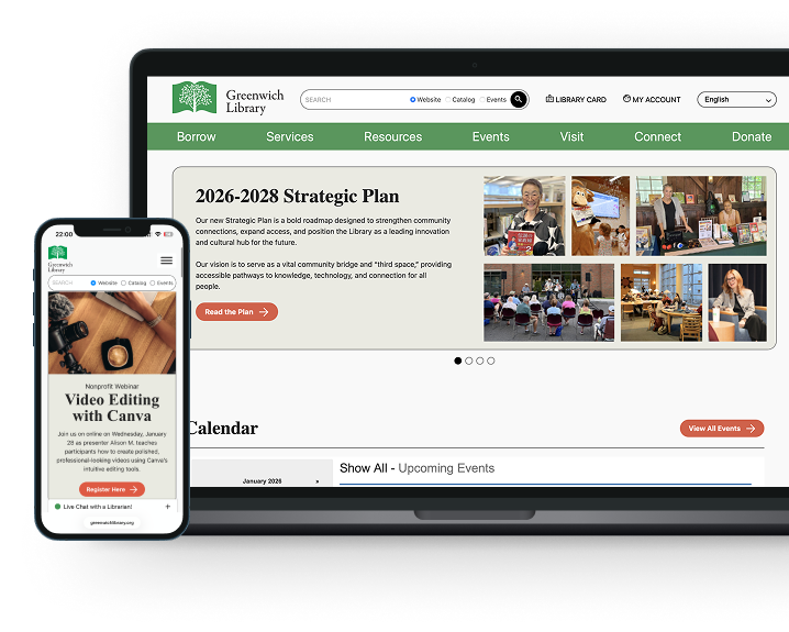
- Homepage: The homepage was restructured to act as a clear entry point, prioritizing core library actions and aligning its structure with inner pages to support fast orientation.
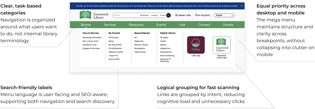
- Mega Menu: Navigation was redesigned into a task-based mega menu with simplified labels and logical groupings, reducing ambiguity and supporting scan-based decision-making.
- Branch Pages: Branch pages were standardized to present location-specific information, services, and events consistently, helping users quickly understand what’s available at each branch.
- SEO: Page structures, URLs, and internal linking were preserved and refined to maintain search visibility while improving clarity and page intent.
Research Snapshot
Instead of traditional user personas, the project relied on behavioral patterns identified through analytics, usability testing, and session recordings. These patterns revealed how users actually entered, navigated, and exited the site — and directly informed the UX decisions outlined below.
Observed constraints are mapped to corresponding design signals, translating research findings into structural and hierarchical decisions across the experience.

Search-first users (Google → inner pages)

Nearly 50% mobile users

Low scroll depth (most users stay within 2–3 folds)

Users confused by navigation labels and hierarchy

Multiple user groups: patrons, staff, first-time visitors
FROM DESIGN SIGNALS TO UX WINS:
WHAT WAS IMPROVED
Wireframes as a Tool for Clarity
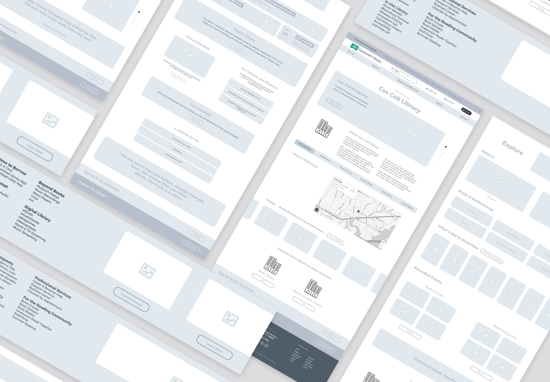
We used wireframes to test the page structure, content hierarchy, and navigation before moving into visual design. That gave the library team a chance to resolve content and navigation questions early.
A Homepage Designed to Guide, Not Overwhelm
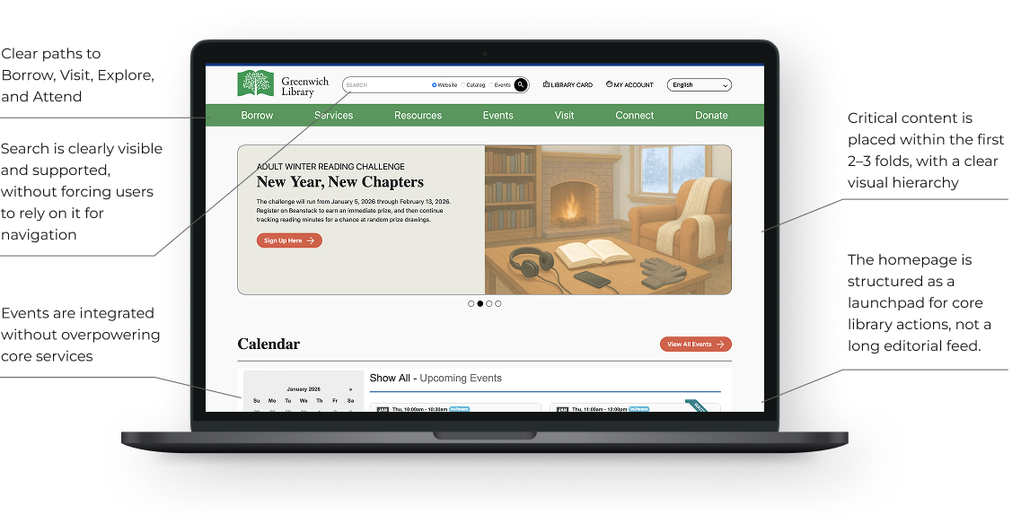
Research showed low scroll depth and heavy reliance on search, requiring immediate clarity. The homepage structure mirrors inner pages, making it intuitive even for users arriving after browsing internal content. Content density was reduced through clearer hierarchy, spacing, and labeling.
Mega Menu
That Reduces Friction, Not Adds It
Research revealed that navigation labels and hierarchy caused confusion, forcing users to rely on search. Navigation was redesigned around user intent, not internal library structure. The mega menu was redesigned to align with user mental models and support fast scanning across devices.
Clear Visual Hierarchy
Above the Fold
Critical content is prioritized above the fold in direct response to low scroll depth and search-driven entry patterns observed in research.

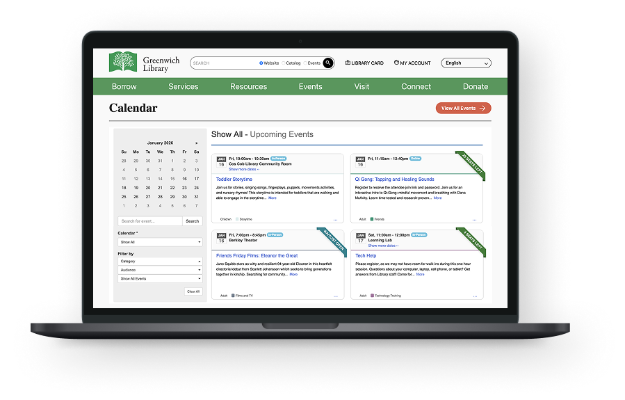
Events Integrated, Not Dominating
Events are integrated into the homepage without overpowering core services.
Mobile-First Hierarchy
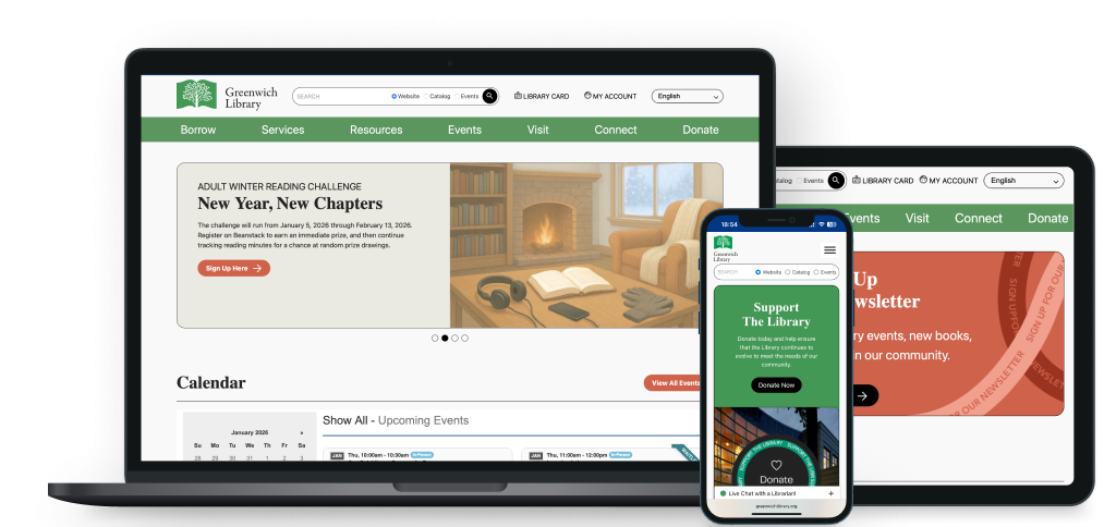
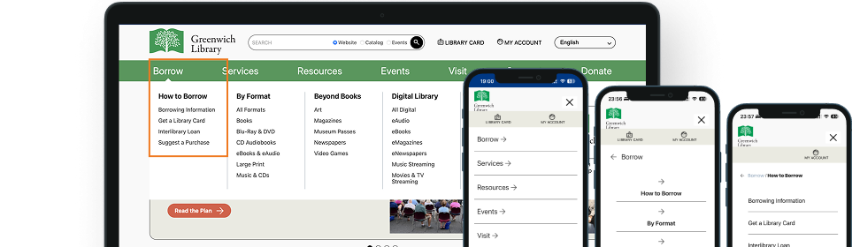
Research showed that nearly half of users accessed the site on mobile, with similarly low scroll depth and high reliance on search across devices. In response, the homepage and navigation hierarchy were designed mobile-first, ensuring that content priority, labeling, and structure remain clear even on smaller screens.
Core actions and services retain their order and meaning on mobile, preventing the experience from collapsing into clutter and supporting fast, scan-based use in short sessions.
UX Win:
SEO
SEO
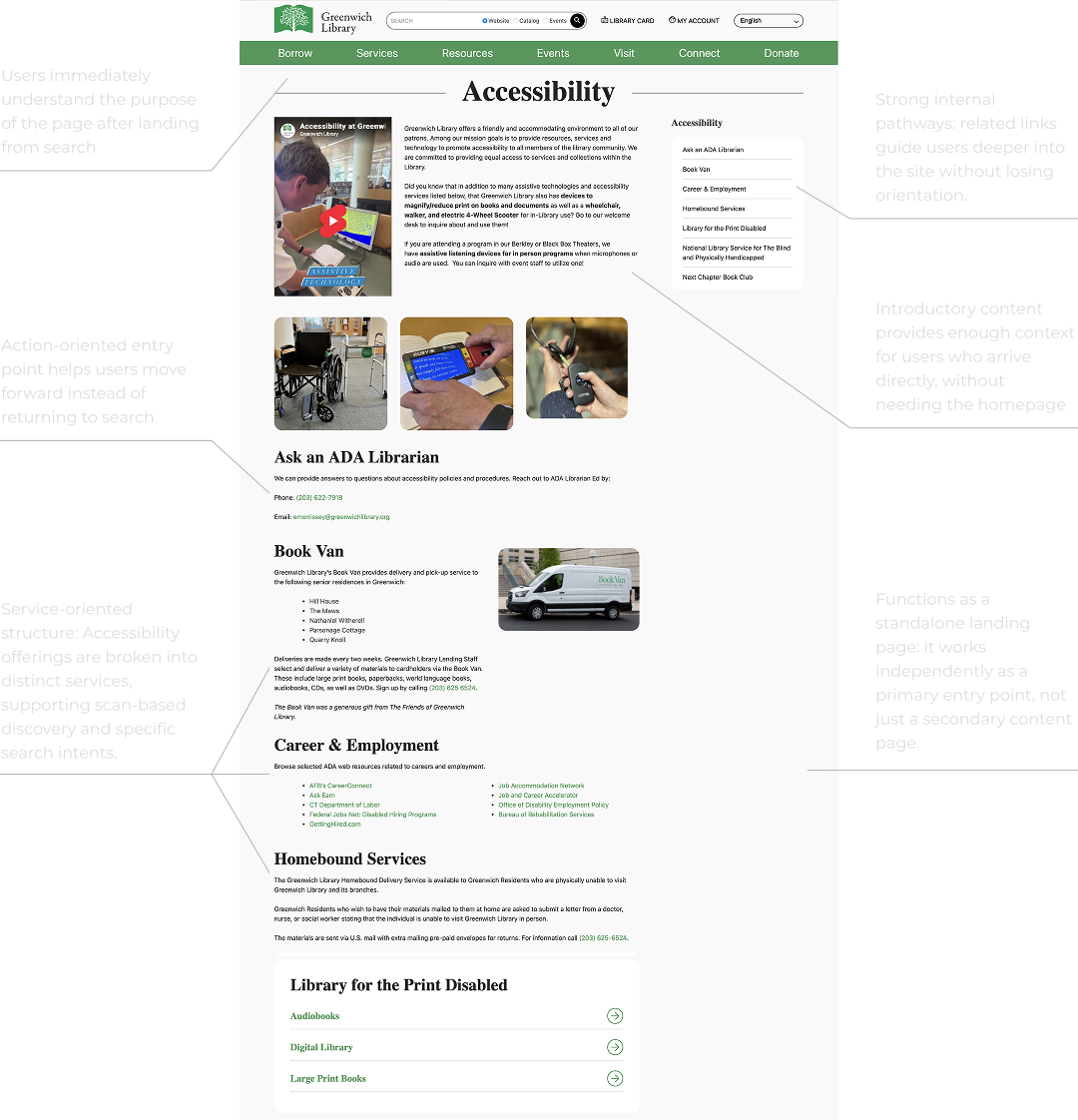
SEO was a critical constraint throughout the project. Research confirmed that search was the primary entry point for most users, making it essential to preserve existing visibility while improving usability.
The redesign maintained URL equity and indexing while restructuring pages to function as clear landing experiences. Page intent was clarified through hierarchy and headings, duplication was reduced, and internal linking was improved — supporting both search engines and search-first users without compromising discoverability.
THE
Results
- The homepage and internal pages give visitors clear starting points for common library tasks.
- Task-based menu labels make services easier to spot in the navigation.
- Branch pages give each location a consistent place to show its services and events.
- The redesign retained key URLs and clarified page headings and internal links.
- The platform is now scalable, accessible, and structurally prepared for future content growth.